Pelham City Schools presents new visual identity
Published 9:32 am Tuesday, August 11, 2015
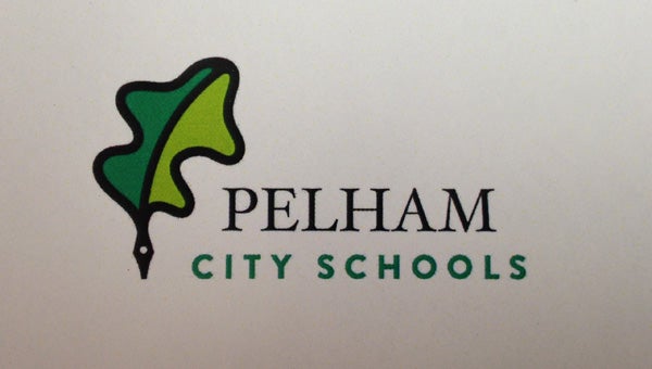
Pelham City Schools’ new logo featuring an oak leaf and stylized quill pen. (Contributed)
By JESSA PEASE / Staff Writer
PELHAM— Communications manager for Pelham City Schools, Nicole Knight, presented the four new branding elements of the Pelham school district at the board of education meeting Aug. 11.

Pelham Panther
Pelham City Schools began the rebranding project earlier this summer when they were finalizing the gym renovation plans at the high school. They needed to determine what the new logo on the floor was going to look like.
“When we discussed options, it became clear there had been a lot of different branding elements in use over the years — different P’s, different mascots, different colors,” Knight said. “It really opened up our conversations about the opportunity to create a unique look for Pelham that could be used consistently.”
Knight said it was important to them that Pelham’s brand had a strong voice, creating pride in the schools and community, and they wanted the logo to mean something. After using surveys, along with the vision, beliefs and mission statements of Pelham City Schools, the district created four icons.
Perhaps the most important: The panther. The panther is a “fresh, confident and visually striking” panther built from two stylized P’s, identifying the logo as the Pelham Panther.
“The panther is something that is just very unique and different,” Knight said. “We were looking for something that would provide an element to our brand that isn’t just clip art or something that’s been used in other schools.”
The mascot is still under consideration, pending input from the students. They will conduct surveys next week to gauge student excitement for the logo before they officially adopt it.
The other icons consist of a Pelham City Schools logo, featuring a stylized oak leaf “married with a modern interpretation of a quill pen,” which also utilizes a new color pallet. The color pallet includes the classic Pelham colors and adds additional modern green and gray tones. The P and the Pelham Panthers logos were also updated with new fonts and distinctive designs.
Pelham City Schools presented the staff and faculty with a sneak peek of the new brand at Institute Day Aug. 6, and Knight said everyone seemed enthusiastic about Pelham’s new face.
“Every one seems very excited about having a consistent look and having a color pallet that includes some fresh colors along with our classic colors,” she said. “We are really just excited about how this will really create a path forward for a consistent look across all of our schools.”
Pelham will begin implementing these elements as the new school year begins and as they have the opportunity to change out logos.
“We’re really excited about it and hope everybody has as good a reaction to it as we’ve all had,” Knight said.
More News


-
-

-
Polls
 Loading ...